ETERNA project

[ ORIGINAL DIGITALIQUE CASE STUDY ]

ETERNA

ARCHITECTING A TIMELESS VISUAL IDENTITY FOR A PREMIUM WELLNESS BRAND

05 / 11

[ ABOUT THE PROJECT ]

ARCHITECTING A TIMELESS VISUAL IDENTITY FOR A PREMIUM WELLNESS BRAND

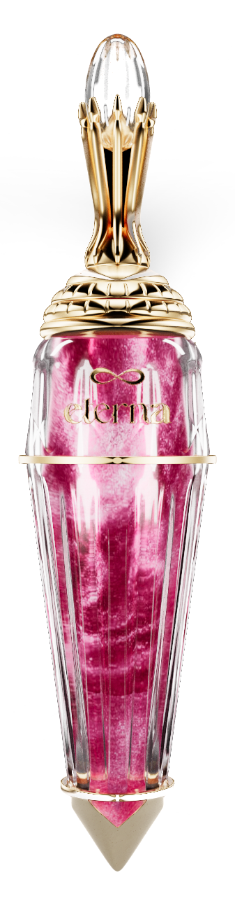
The Eterna brand identity is built on refined elegance, with a color palette that blends soft pinks, rich golds, classic blacks, and pure whites. These elements combine to reflect the delicate balance between modern luxury and timeless beauty.

[ SCOPE ]

  • Brand identity
  • Packaging
  • 3D visualization
  • Production design
01

DESIGN FEATURES

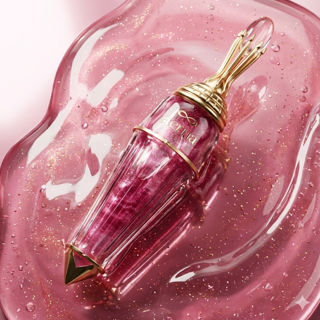
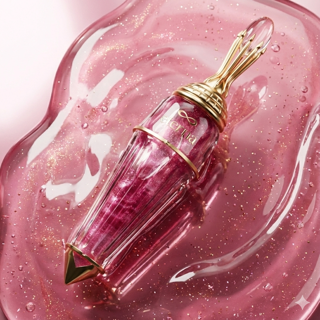
Golden Metallic Capsule: A symbol of exclusivity and luxury, elevating the experience from the very first touch.

Elegant Glass Bottle: The transparent design allows you to appreciate the rich pink essence, while the glass conveys purity and sophistication.

Premium Color Palette: The harmonious blend of pink, gold, black, and white reflects the essence of elegance and high-end skincare.

Sleek, Modern Branding: The Eterna logo, with its minimalist yet bold design, embodies the perfect marriage of elegance and contemporary refinement.

02

THE AMBITION

The wellness and skincare market is saturated with “me-too” brands. Eterna came to us with a vision to break the noise. The challenge was to build a brand identity from the ground up that didn't just look “pretty,” but felt authoritative, scientific, and high-end.

The goal was to create a visual language capable of competing with global luxury leaders in the EU and UAE markets, ensuring the brand felt like a “legacy in the making” from day one.

03

THE CONCEPT OF TIMELESS SCIENCE

We moved away from fleeting trends, focusing instead on the concept of “Biophilic Minimalism.” We wanted the customer to feel the precision of a laboratory and the serenity of a spa through every touchpoint.

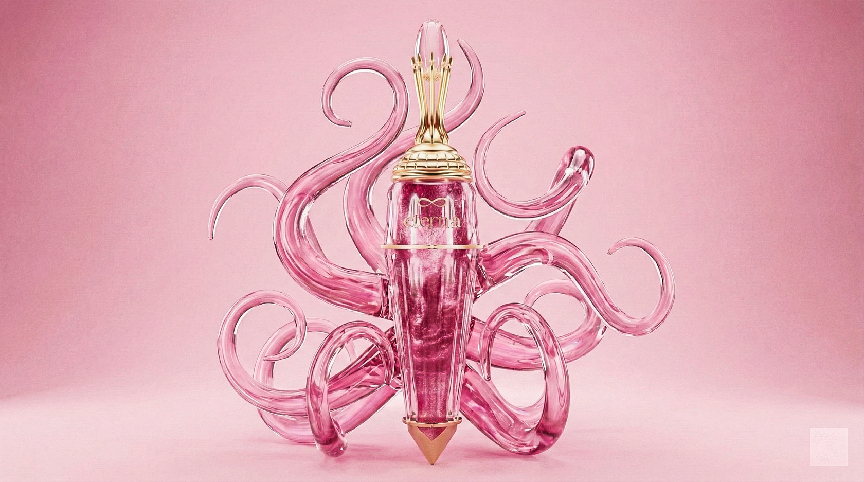
Every design element, from the golden capsule to the sleek glass bottle, speaks to the premium, high-end nature of the brand.

04

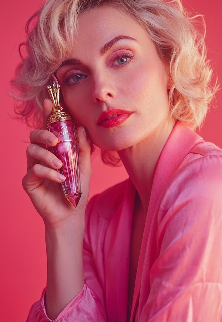
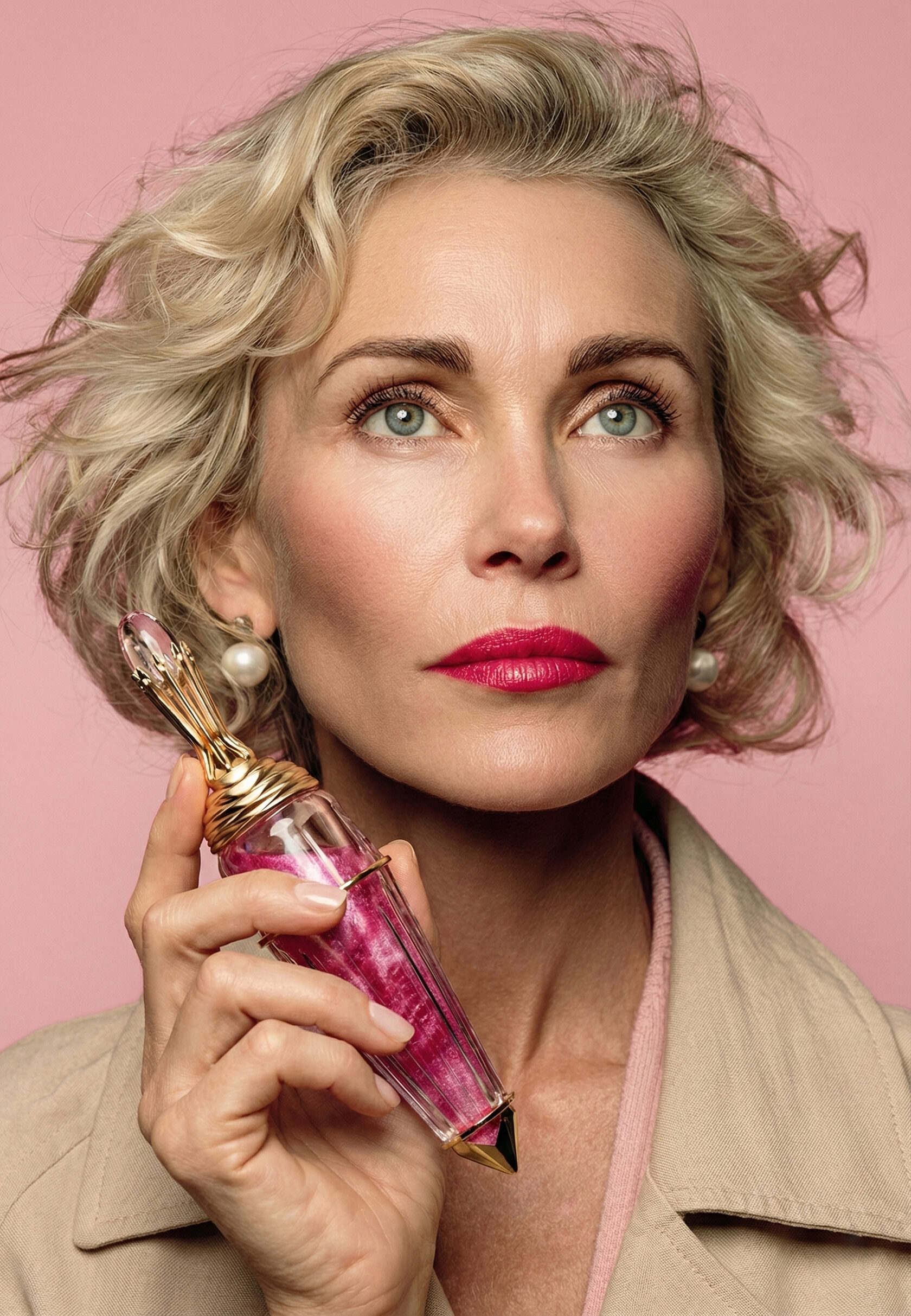
THE ULTIMATE EXPRESSION OF LUXURY FOR MATURE SKIN

EXCLUSIVITY — Every design element speaks to the premium, high-end nature of the brand.

TIMELESS BEAUTY — The color palette, typography, and overall design convey a sense of elegance that transcends fleeting trends.

TRANSPARENCY AND TRUST — The transparent glass and minimalist design elements reinforce the brand's commitment to high-quality, trustworthy skincare.

EMOTIONAL CONNECTION — The warm pink tones and luxurious gold accents aim to forge a deeper emotional bond with the consumer.

05

MARKET-READY EXCELLENCE

Eterna is no longer just a concept; it is a market-ready powerhouse.

INSTANT CREDIBILITY: The new identity positions Eterna alongside heritage brands, allowing for premium pricing and high-end retail placement.

PRODUCTION PRECISION: All designs were delivered with 100% technical accuracy, ready for complex printing processes (hot stamping, silk screening).

INVESTOR APPEAL: A cohesive, global-standard brand presence has provided the client with the confidence to pitch to international distributors and investors.

[ ACHIEVEMENTS & RESULTS BY DIGITALIQUE ]

Achievements

01

100% PRODUCTION ACCURACY

02

TOP-TIER BRAND STANDARDS

03

INVESTOR-READY ASSETS

04

SCALABLE BRAND ARCHITECTURE

05

SUSTAINABLE DESIGN ENGINEERING

YOUR PRODUCT DESERVES A VISUAL IDENTITY THAT REFLECTS ITS TRUE VALUE.

[ NEXT PROJECT ]

MONACO BAGEL

[ CONTACT ]

Your order

Within 24 hours. Just leave a request.

anna@digitalique.pro ↗