
MARITIME INJURY LAW FIRM project

[ ORIGINAL DIGITALIQUE CASE STUDY ]

MARITIME INJURY LAW FIRM

REBRANDING & IDENTITY DESIGN

09 / 11

[ ABOUT THE PROJECT ]

REBRANDING & IDENTITY DESIGN

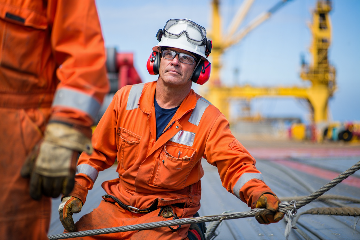
The Maritime Injury Law Firm (TMILF) is a specialized legal practice dedicated to protecting the rights of maritime workers. Operating in a high-stakes, industrial environment, the firm positions itself as a critical barrier between the chaos of an accident and the recovery of the victim.

Digitalique was commissioned to execute a comprehensive rebranding that transforms the firm from a standard legal service into a powerful symbol of advocacy, protection, and industry-specific expertise.

[ SCOPE ]

  • Brand strategy
  • Rebranding
  • Identity
  • Touchpoints
01

THE TASK

The objective was to move beyond the “corporate stiffness” often found in legal branding and create an identity with deep emotional and strategic resonance.

Digitalique was tasked with developing a visual system that conveys both the firm's unwavering strength (“The Warrior”) and its deep commitment to the families of those injured (“The Caregiver”).

The challenge was to bridge the gap between technical maritime authority and a warmly human, protective presence.

02

CONCEPT & STRATEGY

The strategy developed by Digitalique is anchored in a bold brand manifesto: “Between the storm and the victim stands the law.” We defined the brand as a “Guardian” that acts decisively to protect justice while remaining compassionate toward the lives and stories it represents.

Brand Persona: Digitalique personified the brand as a 45-year-old former naval officer turned attorney—steady, informative, and measured in voice, but functional and grounded in style.

Archetypes: A dual-archetype approach combining The Hero for decisive action and The Caregiver for family-first compassion.

Tone of Voice: Confident, caring, and clear communication designed for trust and authority.

03

CORPORATE IDENTITY

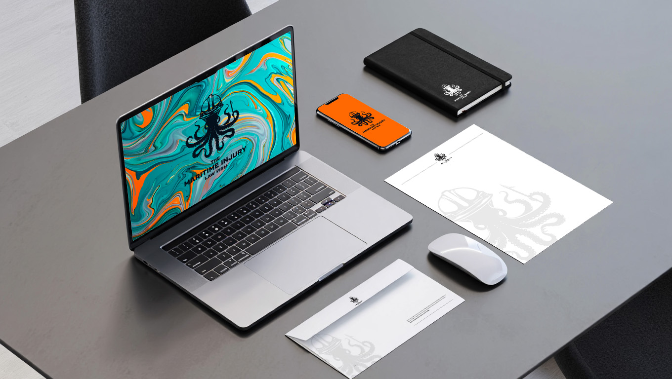
Digitalique selected a high-contrast palette that directly references the maritime and rigging environment.

Primary Foundation: Marine Teal (#008C8C) for the calmness of the sea and Offshore Silver (#C0C0C0) for professional trust.

Safety Accents: Safety Orange (#FF6700), inspired by industrial safety gear, used for high visibility and emotional impact.

Supportive Tones: Crude Oil Black (#101820), Rig Rust (#8B3E2F), and Sand Beige (#C4A484) add depth and industrial context.

Typography: Digitalique implemented the Gill Sans MT family. This sans-serif choice offers sharp, confident borders that look more authoritative while remaining legible across all media.

04

VISUAL LANGUAGE

The visual language developed by Digitalique uses powerful metaphors to reinforce legal direction.

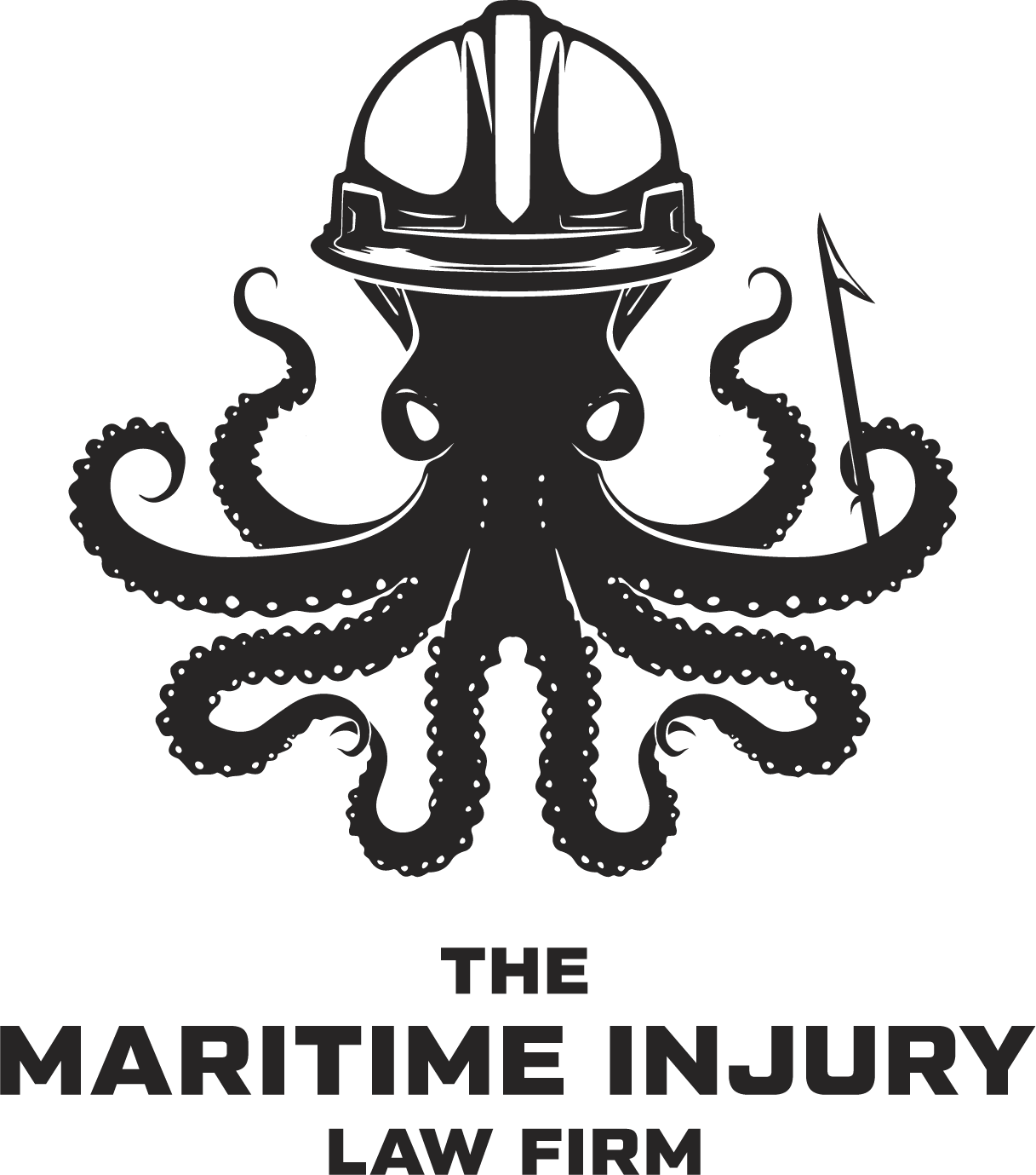
Metaphors: Compasses (direction), stormclouds with light beams (danger + solution), and chains (solidarity/strength).

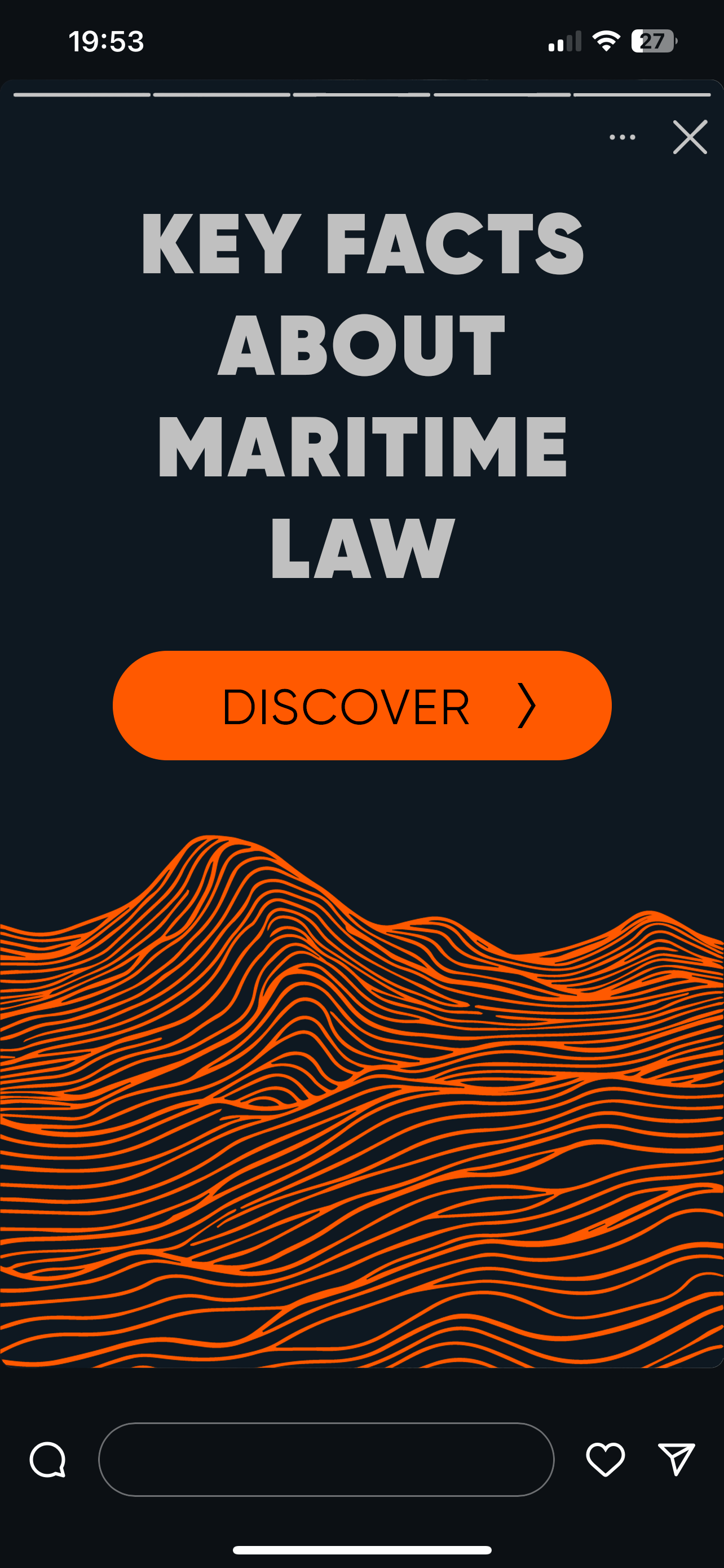
Graphic Motifs: We introduced wave lines, ropes, and oil iridescence patterns to give the brand a modern, high-fidelity finish.

05

TOUCHPOINTS

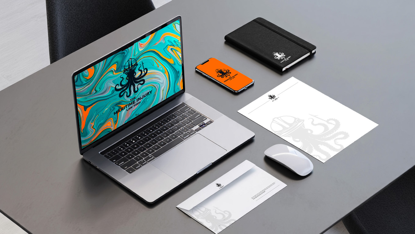
To ensure a seamless brand experience, Digitalique extended the identity across all physical and digital spaces.

Office Branding: High-end interior concepts featuring bold logo applications and a palette that reinforces the firm's strength.

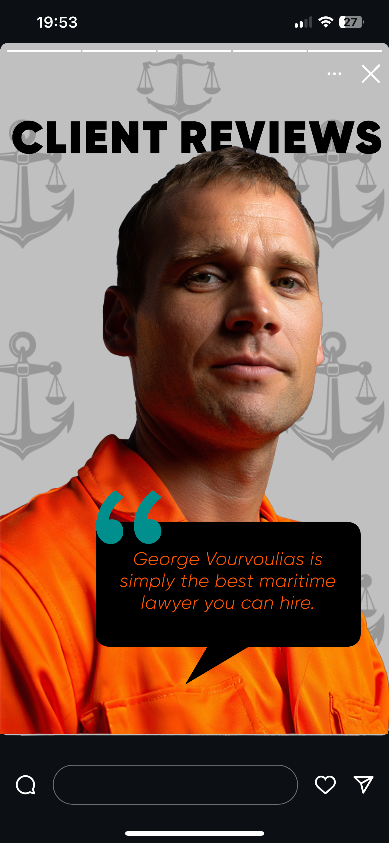
Emotional Campaigns: Creatives with messages like “You deserve it” and “Tell her you are safe” to connect with the personal motivations of injured workers.

Branded Touchpoints: Practical items such as client safety kits that carry the firm’s mark into the real world.

[ ACHIEVEMENTS & RESULTS BY DIGITALIQUE ]

Achievements

01

MARKET POSITIONING

02

EMOTIONAL CONNECTIVITY

03

OPERATIONAL CONSISTENCY

PARTNER WITH US TO ENGINEER A BRAND IDENTITY THAT WINS TRUST AND DRIVES MOMENTUM.

[ NEXT PROJECT ]

VOIS

[ CONTACT ]

Your order

Within 24 hours. Just leave a request.

anna@digitalique.pro ↗